"Icons of the Silver Screen" Miss USA & Miss Teen USA State Titleholder Photoshoot 2024
Taylor Swift’s TTPD era X Beyonce’s Single Ladies X 1950s Silver Screen Era
Enter our theme for this year’s Miss USA & Miss Teen USA photoshoot for 14 titleholders headed to Nationals next week: “Icons of the Silver Screen”
The idea came after mindless scrolling on Tik Tok & Instagram. I work hard to curate my instagram feed with inspiration outside of the pageant world, as I like to bring new ideas every. single. time. I shoot.
I came across a photographer in Europe (shoutout Dominikzky) who was using a projector to capture black & white images, project them onto a giant wall, and have their male model pose in front of it. His work was wonderfully masculine, slightly casual, and very artistic. I saw right away how I could take the base idea, apply my 18+ years of pageant knowledge, and bring to life a similar idea, but in a way pageant titleholders would love. The idea in my head was born.
Then came the hunt for a projector. It just so happens my neighbor is a painter who has experience in full sized wall murals, and was kind enough to let me borrow it for the shoot. (Thank GOD for art friends!)
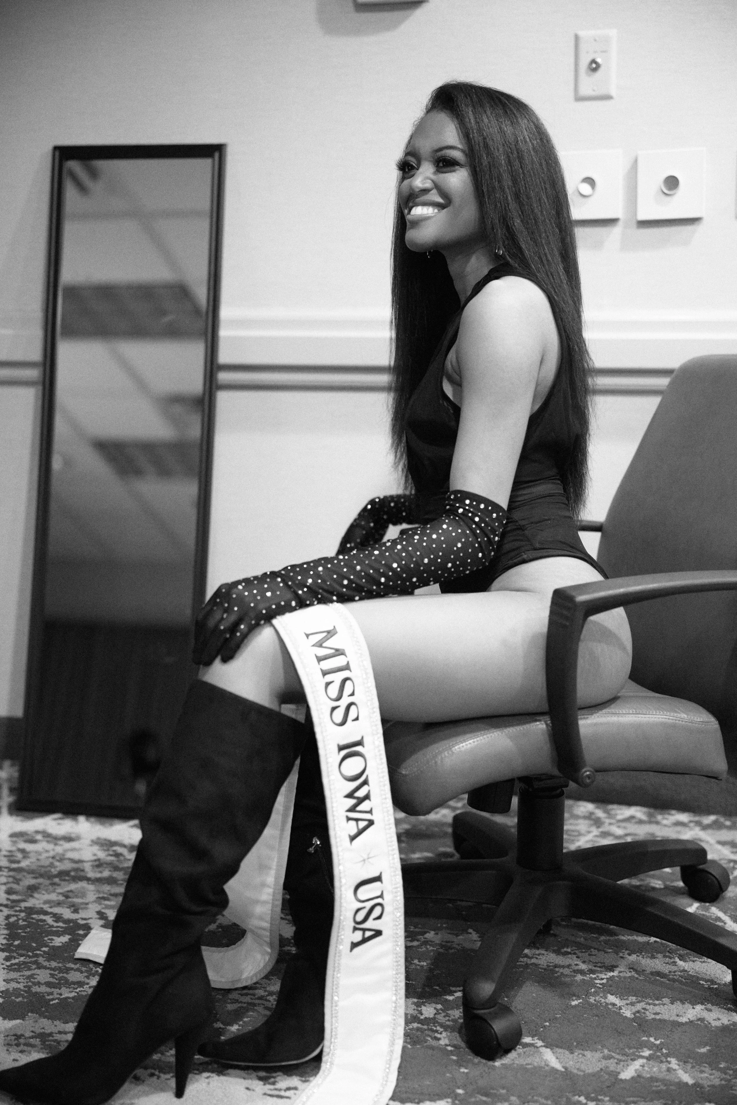
Pulling the team together, we gathered Brenda Torre, another Future Productions sponsor, to bring our shoot vision to life. The titleholders brought all black bodysuits to their photoshoot during their Pageant Power Week which helps them prepare for Miss USA & Miss Teen USA.
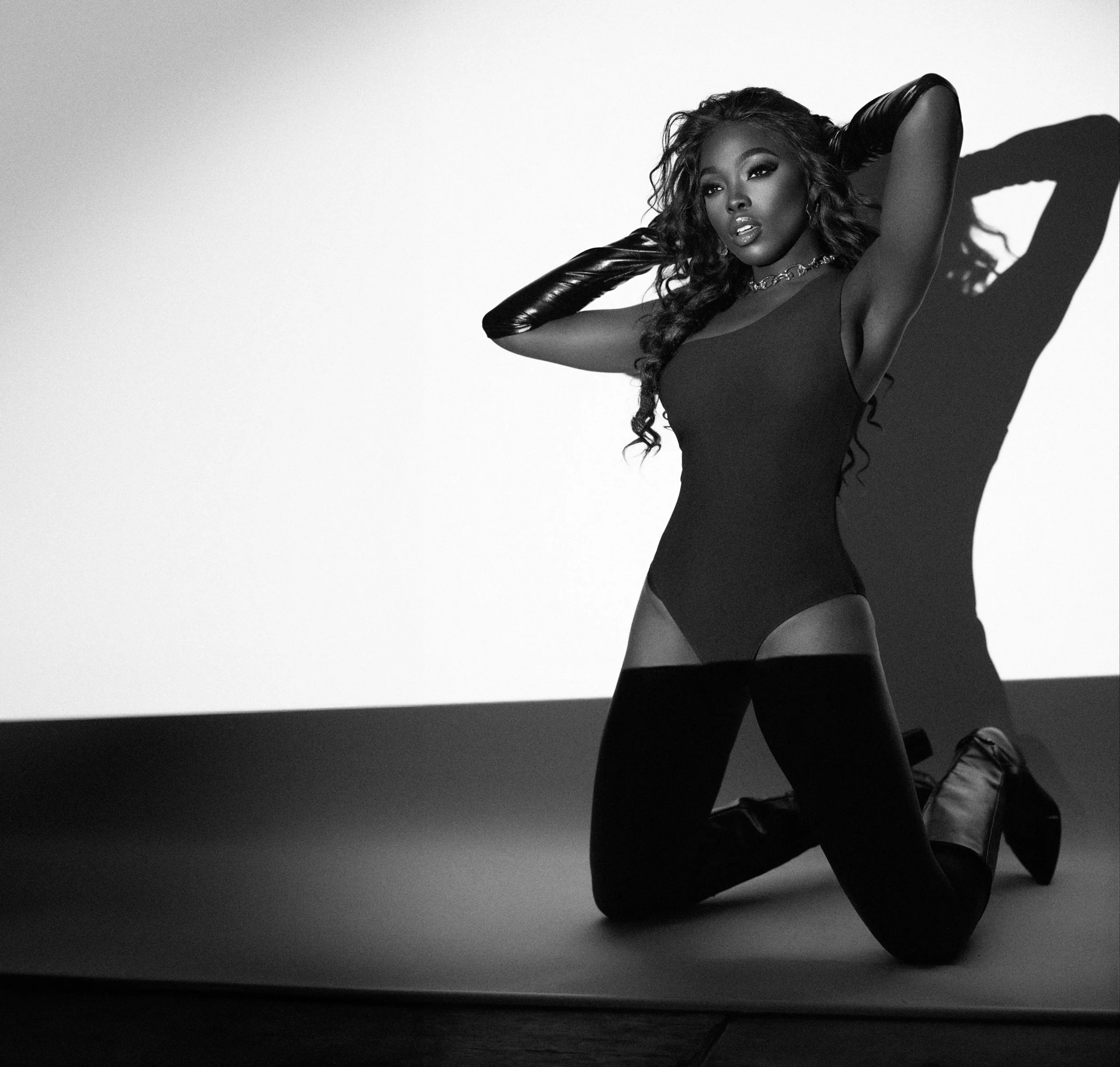
We got to shooting, and one of my biggest surprises was just how much I loved the first images, using only the projector light, that we then used to project against the wall. I love the overlapping complexity of titleholders modeling with the Teen USA & Miss USA crowns and their own images, but also love the simplicity of the black & white direct light. One of my art friends in the pageant community commonly posts “Learn the rules like a master so you can break them like an artist.” That’s what we did on this photoshoot. You’re not “supposed” to up-light models (the light is coming from below) because it looks like a horror movie. You’re not “supposed” to let shadows fall on your background because it looks unprofessional. You’re not “supposed” to have grain in your images because it means you didn't have enough light.
And I did all three—and I love it! The uplighting was dramatic, the shadows (especially of the crowns) was dramatic, and the natural (and enhanced in post production) grain added texture to the photos to give them a timeless feel. I hope you love how they turned out as much as I do!
Photography; Brittany Link
HMUA: Brenda Torre
Models: Miss USA & Miss Teen USA state titleholders for Future Productions State Pageants
Thanks for reading!
XOXO
Brittany


